NYC Ballet
Year
2023
Category
Brand Identity
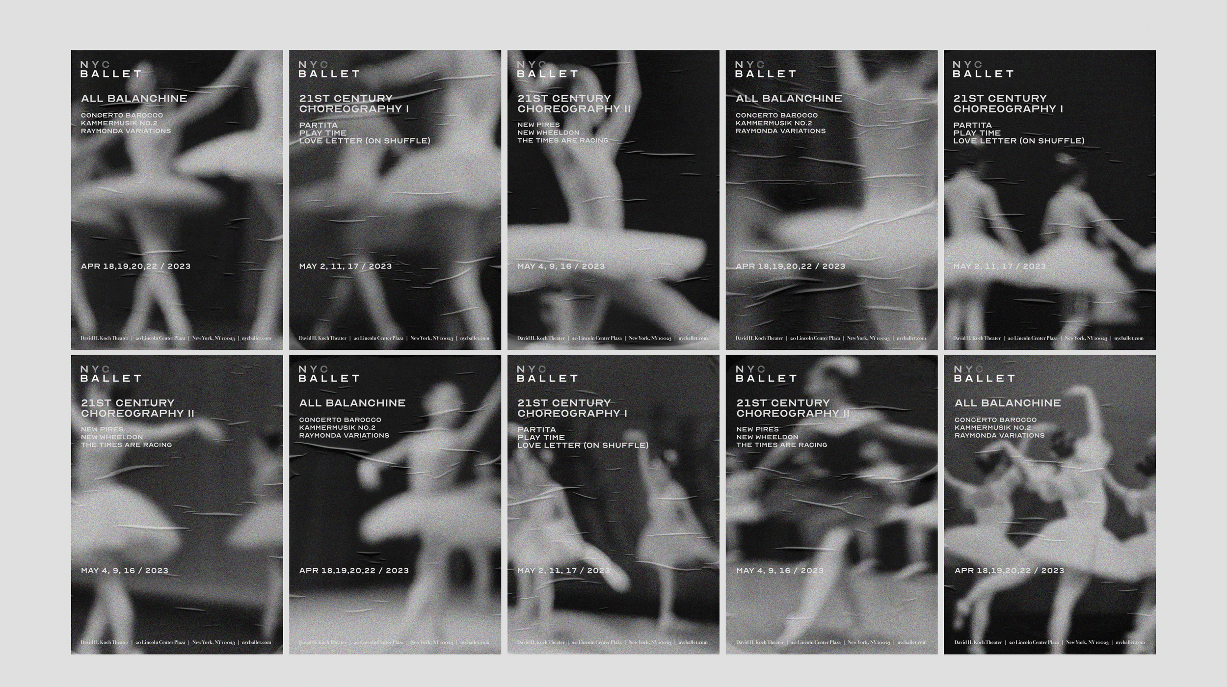
The NYC Ballet rebrand aimed to give the esteemed ballet company a fresh visual identity, highlighting the elegance of ballet and its cultural importance in New York City.
Color
I chose a classic black, white, and gray color palette to give the NYC Ballet a timeless and elegant look. This ensures that all eyes are on the dancers and their mesmerizing performances, emphasizing the grace and beauty of the art form.
Logo
Before
After
Symbol
David H. Koch Theater
Flower Symbol
Symbol
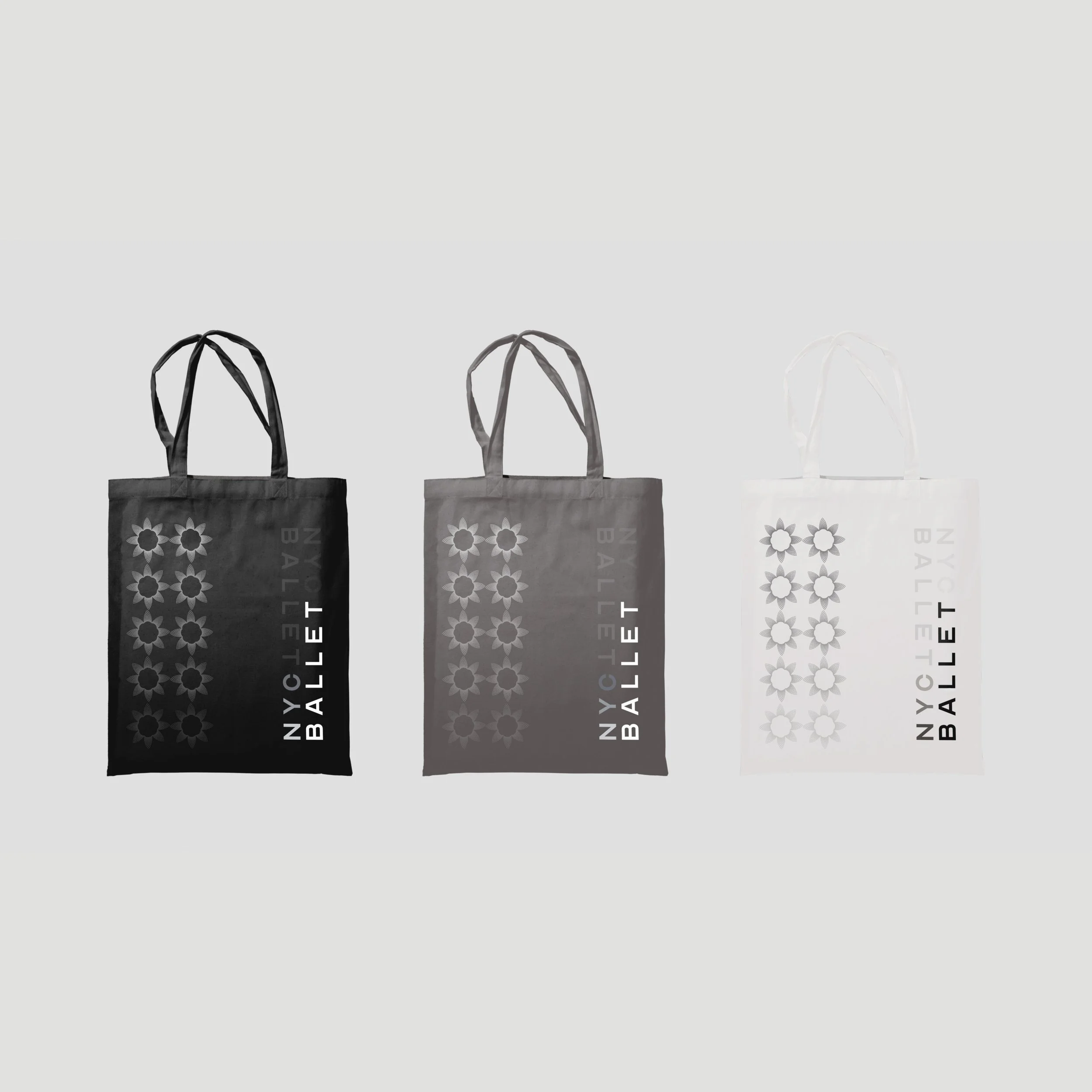
The symbol, shaped like a flower and inspired by the David H. Koch Theater's ceiling, does more than just look pretty. It cleverly includes a unique lighting feature, adding a special touch to ballet performances. This innovative design boosts the beauty of the shows, making them visually striking and unforgettable for the audience.


